


The Meaning of Life by Kate Crane
As a fairly prolific and long-term art journaler, I am always looking for new ideas to try out in my journals. However, there are recurring and repeating features that always seem to appear – bright colours, lots and lots of layers, stenciling and stamping!
Recently I have been playing with repeating images. We all like a bit of familiarity and therefore repetition can be soothing and relaxing. It’s also a great way to use a small stamped image on a larger page, an image that would usually get lost on a larger scale page.
The Meaning of Life by Kate Crane Directions:
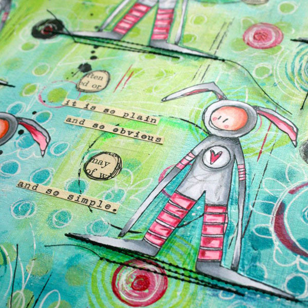
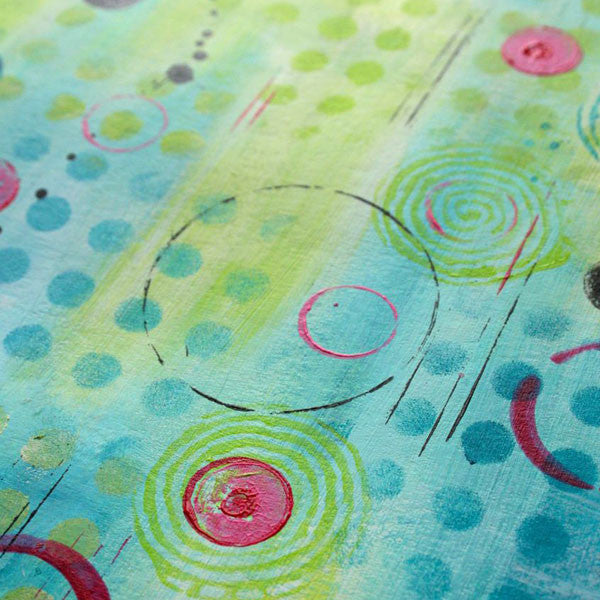
Begin by painting white acrylic paint onto the page, and then brush touches of turquoise paint into the white while it is still wet allowing the turquoise to blend into areas of light and dark.
When this is reasonably dry, add areas of lime green in roughly blended patches.
Randomly sponge both of these colors through a stencil all over the background. You can also stamp these colors using paint on any of your background stamps (just make sure you wipe it off straight away!) As long as you stick to these colors you can keep going with the layers and your background will look nicely busy but not too cluttered.
Scrape a little black around the edges with a palette knife, and add some circles by using an old bottle lid dipped into paint. If you add a little water to the paint you can also add a few black splats with a fine paintbrush. I love adding black, it makes the other colors pop!
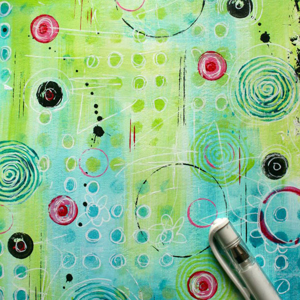
Now it’s time to add a contrast color with a little more junk stamping. I chose to add a hot pink because I had already colored my stamped images and I wanted to choose a color that was featured on those.
Doodling is a lovely way to add some definition to a background and I especially like adding detail with a white Signo Uniball pen. I most often doodle around shapes that I already created with stenciling and stamping.
Stamp your chosen image four times, color and cut out. Cut one image in half down the centre. Uneven numbers usually work best as a repeating image, and even though I stamped four here I cut one in half so the eye sees five.
Once the images are glued to the page it helps to ground them with a bit of stitching, or maybe just a strip of Washi tape or even a strip of vintage text.
Finally add a quote or some journaling. I typed and added a quote that I stumbled upon on Pinterest, I just love the simplicity of this quote and it really reminds me not to overthink things! A few scribbled circles on some old text help to bring everything together on the page.
“The meaning of life is just to be alive. It is so plain and so obvious and so simple.” — Alan Wilson Watts
Free Shipping on Subscriptions
Easy 60 Day Returns
Friendly Customer
Support


The Meaning of Life by Kate Crane
Frequently asked questions
Looking for a quick answer? Here are some of our customer’s most frequently asked questions to help you along the way.
Thanks for your interest in our magazines! We encourage you to visit our Calls & Challenges page to see what our editors are looking for.
Ready to begin? Here is where you can find our Submission Guidelines.
Our subscriptions ship directly from our printer in Wisconsin. For this reason, we need to be notified of your change of address at least two months before the next issue comes out, or it will be sent to the address we had on file and provided to our printer at the time it was due.
How to Notify Us About Your Change of Address
- Email the following to customerservice@stampington.com:
- The publication(s) you subscribe to
- Your name and new address
- Your old address
2. Call to inform us of your new mailing address:
- Toll-Free: 1-877-782-6737 or International: 1-949-380-7318
Mail Forwarded by the Post Office
If you forward mail to your new address through the Post Office, it won't apply to periodicals/your magazine subscription unfortunately. Also, since mail forwarding only lasts for a short time-frame, we request that you still notify us of your address change to prevent any service interruption to your subscription.
Stampington & Company cannot be held responsible for replacing "lost" issues from your subscription, if we did not receive your change of address request at least two months prior to your next issue's release date.
Subscription issues should arrive within the first week of the month your publication is released. Please add up to two weeks for international delivery.
If your magazine has not arrived by the 20th of the month, please contact our customer service department, so we can check to make sure nothing is amiss with your subscription, and see if you're eligible for a replacement copy. International subscribers can receive a digital version of the magazine as a replacement if one attempt has already been made to deliver the print edition to you.
Stampington & Company cannot be held responsible for postal delays or circumstances outside of our control, but we will make every effort to make it right.
We offer FREE shipping on all magazine subscriptions and instant download purchases to our customers. You can also take advantage of free U.S. shipping on select pre-orders of your favorite magazines (discounted International rates will apply). Browse our selection of Pre-Orders With Free U.S. Shipping here.
What are my shipping charges?
Shipping charges are calculated by weight, shipping destination, and speed. You will be able to choose the best delivery method for your needs at checkout.
To help keep your costs down, we offer a discounted rate of $5.95 to ship a single magazine to you (within the United States).
Need your order fast? We offer the following expedited shipping options:
- 3-day delivery
- 2-day delivery
*Please contact us if you have any questions or special instructions regarding your rush order.
What Carriers do You Use to Ship Items?


